
Why AI Companies Are Happy To Lose Billions
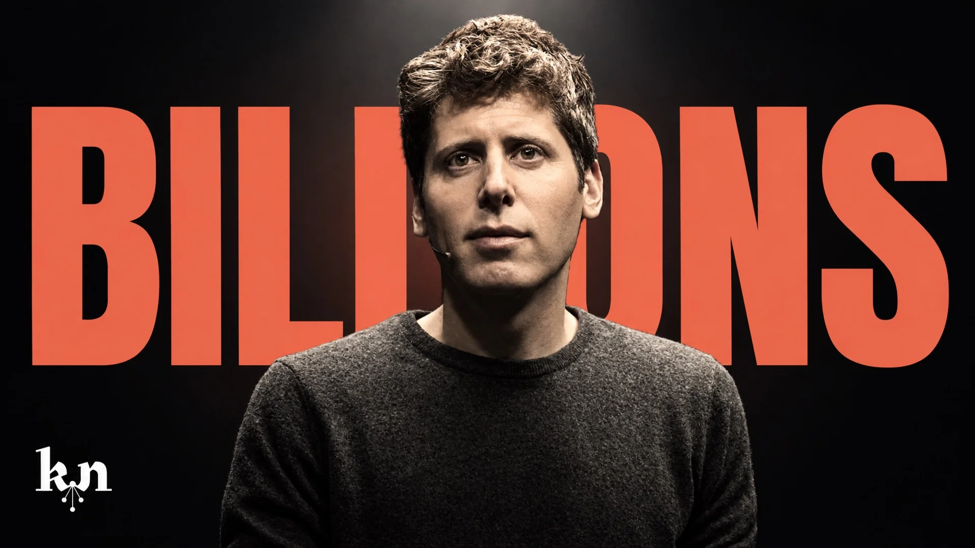
Frontier AI labs like OpenAI and Anthropic are losing more money than almost any companies in history, yet they're the most valuable companies in history, by far. This documentary explores why.
Chapters
From the team
This documentary was made by real humans. We use AI as a tool, like anyone else, for things like asset creation, research and faster workflows, but we really put our hearts into this, which AI can never do, and we hope it comes through. We’re very open to feedback and our goal is to make each episode better than the previous. Thanks for watching! — Christian
How we made it
How the Knowledge Nuke look, and this episode, came together.
Finding the look
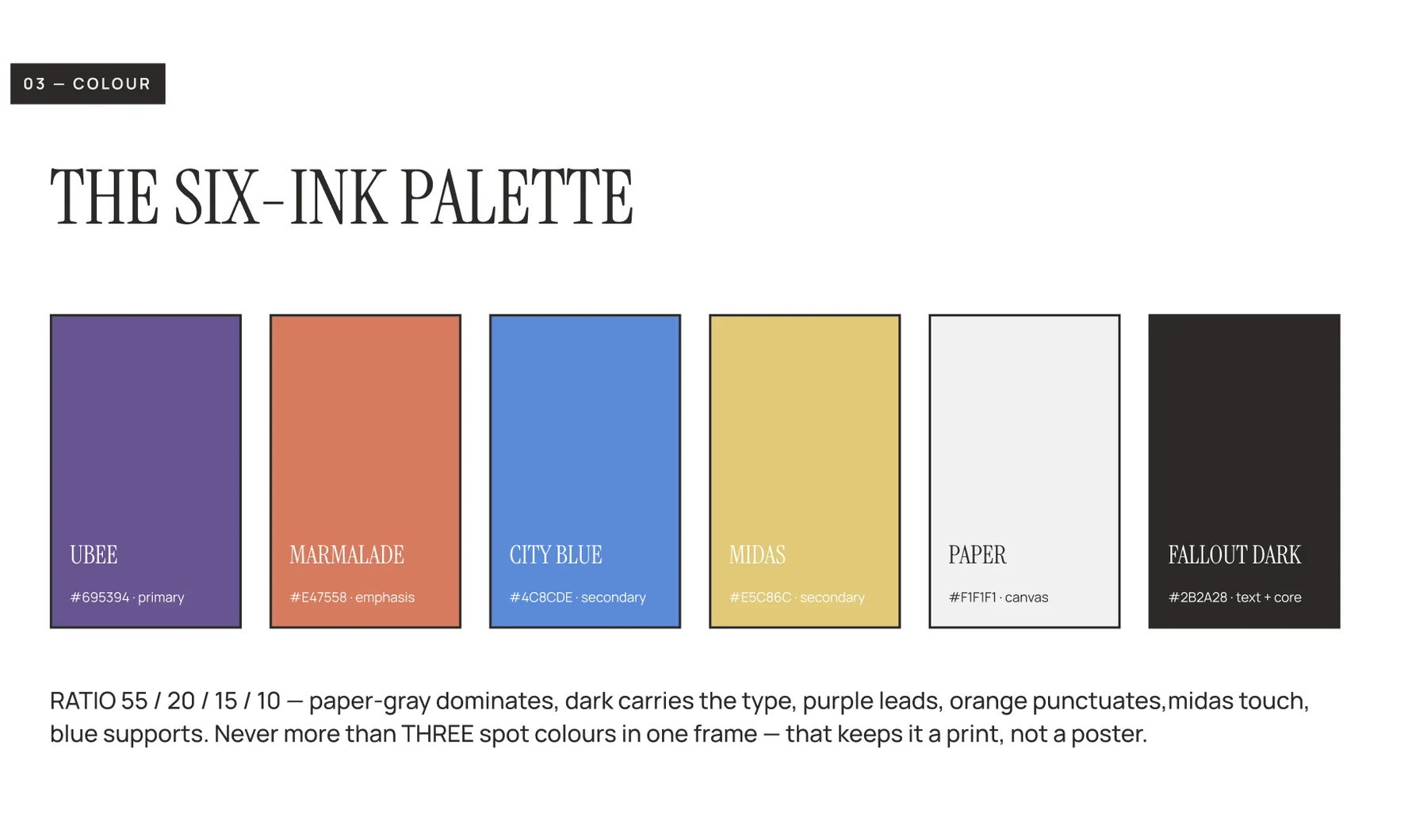
We wanted something that felt printed, not rendered. The team tried a darker palette first, then moved to a light one built on paper: cut-out collage, grain, halftone dots and a limited set of inks with big contrast.
Six inks made the final palette: Ubee purple, Marmalade orange, City Blue, Midas gold, Paper and Fallout Dark. One rule sticks: never more than three spot colours in one frame, so it reads like a print, not a poster.
The mark
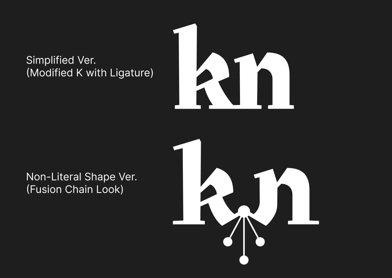
The first logo idea used a rocket and a graduation cap. It was too literal. We wanted a wordmark for the name and a separate icon that works on its own as a profile picture.
Two directions for "kn" came back: a simple ligature, and a version with a node branching out under the letters like a chain reaction. The chain reaction won.
The storyboard
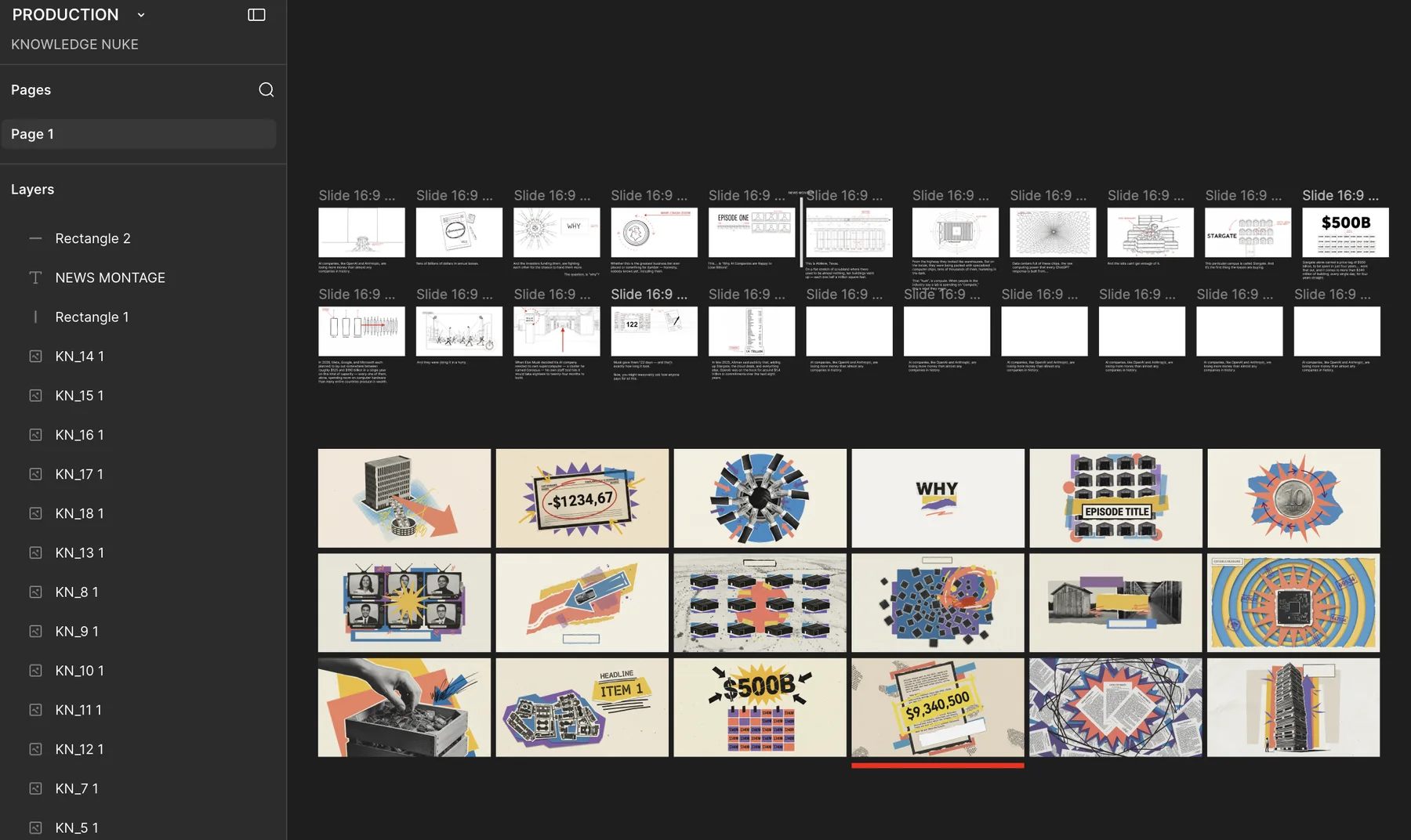
The script was broken down line by line against the voiceover, then turned into more than 160 storyboard panels.
One rule for every panel: completely flat, no perspective. Anything that looked too cinematic was redrawn.
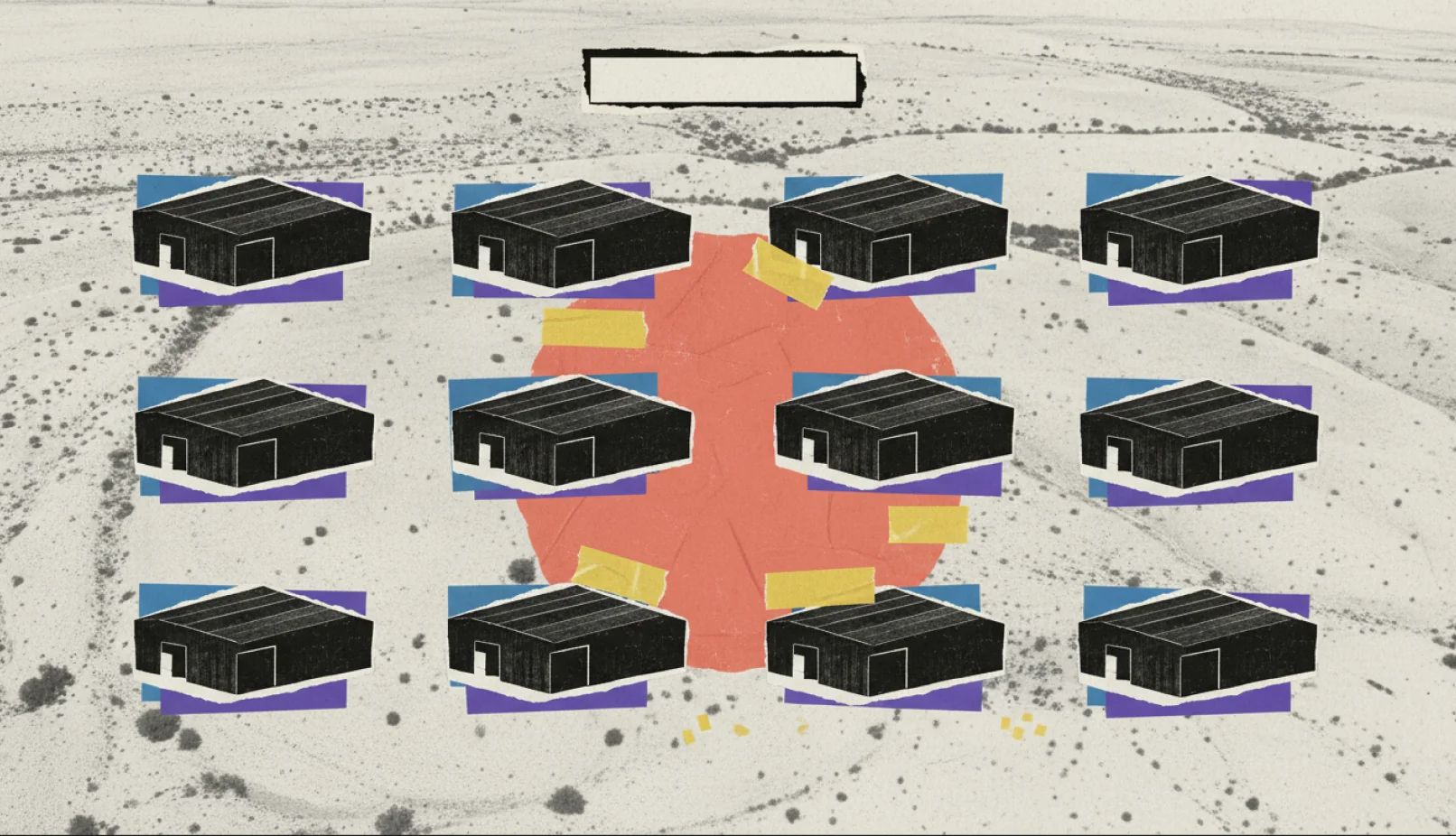
Cutting the paper
Every piece was cut out, cleaned up and composed by hand in Photoshop, frame by frame, like a collage on a desk.
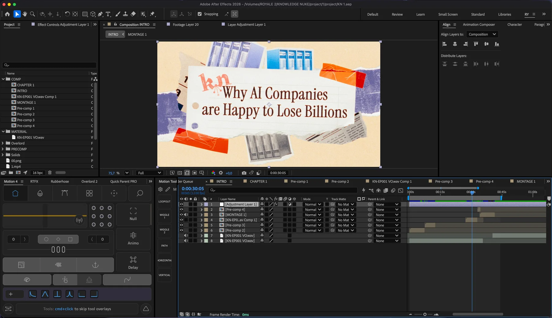
Making it move
Everything was animated in After Effects. The paper pieces move at 12 frames per second so they feel handmade.
The video is built for a TV as much as a phone: 4K, with slower documentary pacing.
What's next
We're happy with how this pilot episode turned out, and we think the visual style is something special. For episode 2 we're going a little lighter on animation and heavier on real footage and photographs, for a more classic documentary feel rather than a 2.5D explainer. Tell us what you think in the comments.
Made by
- Executive ProducerChristian Mullican
- Art DirectorReihan Alka
- Lead AnimatorRijal Nurjaman
- Motion DesignerAndromedaAgil Suyuti
- Graphic DesignerAle NadaAthallasyaf Salman
- StoryboardAndromedaDwi Bachtiar